Like latte art, UI can be a tricky thing to handle. One wrong move with the mug and the whole meaning is changed. But consistency through the process brings to light the design of the artist.
Flexbox provides a clean, consistent way to build out a responsive layout. Its popularity and cross-browser support make it a great resource to implement into your current or future projects.
The Angular Flex Layout package is a great way to apply this functionality to your templates via directives, while also providing the flexibility of responsive breakpoints. Although a great resource, the number of directives required on your template can make things a little cluttered. If you are not inclined to this approach there are great alternatives, like Twitter Bootstrap, if you prefer to just add classes to your elements.
First, the barista must learn to pour
Installing
Alrighty; lets start things off with a fresh install.
npm i @angular/flex-layout@9.0.0-beta.31 @angular/cdk
HTML border Property
Note: At the writing of this article the latest version of Angular Flex Layout 10.0.0-beta.32 doesn’t support Ivy.
Now add a little flavoring to the app.module.ts so your application knows what's going on with the FlexLayoutModule import.
Basic Layout
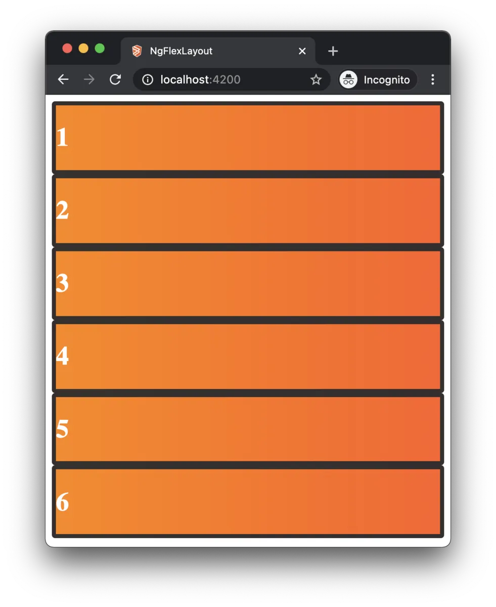
I built out a quick application to showcase Angular Flex Layout. We're going to start off with some simple divs and zero layout.
Let's initiate some flexbox onto the template with the directive fxLayout="row" on the parent div. This will set the display to flex and add a flex-direction. Under the hood this is what the CSS would look like:
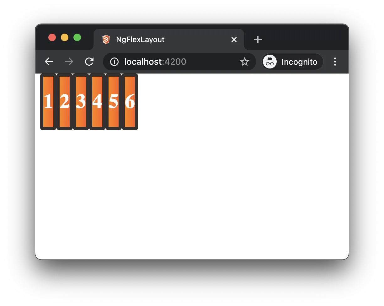
So we've set flexbox and our divs are in a row; now let's take it and make it into something more like what you would see in the real world. Something like this:
Before you read on...
If you would like to attempt to recreate what I did above check out this Stackblitz I created here.
The Breakdown
First, let's begin by moving all the cards into a column inside a parent div with the fxLayout directive like this: fxLayout="column". Then, add some spacing using flexLayoutGap with a value of 50px. Since this is being used on a column the directive sets vertical spacing of 50px between our rows. Under the hood, this adds margin-right: 25px to every child in the container except for the last one. Now, let's organize the cards within this top-level container into three different rows.
Take the first card and put it into its own div and apply fxLayout="row". Then stretch the number one card out full width to represent our banner. On the parent div of the first card put the directive fxFill. This will add flex: 1 1 0%; to the element stretching it out to take up the full width of the screen.
Now create a second row to place cards two, three, and four in. On the main parent div for these four cards, we'll put the fxLayoutGap directive with a value of 25px. This will maintain a space between the cards horizontally no matter the size of the screen. Then upon each of the cards parent div apply the fxFlex directive like we did on the first row; this will cause each card to take up as much width as possible.
In the last row not much will be different and we'll just use a larger gap of 50px.
And lastly, to add a finishing touch, on every parent div of the cards put fxLayoutAlign="center". Using this directive will center the number on each card using justify-content: center.
We've introduced a few different directives from Angular Flex Layout since saying hello to the fxLayout. Here's a quick break down of those we used in the example:
Great work! Though a simple exercise, we were able to introduce you to many of the basic and widely used Angular Flex Layout directives. You can find more from the docs here.
Content Placing
We've built some columns and rows with spacing and other flexing, now let's move into some content positioning. Positioning can be one of the toughest things to deal with in UI design, barring using margin-right: 500px; of course 😉, but if you're like me you want a smooth clean approach that won't clutter up the app.
Let's look at an example:
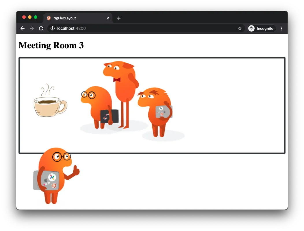
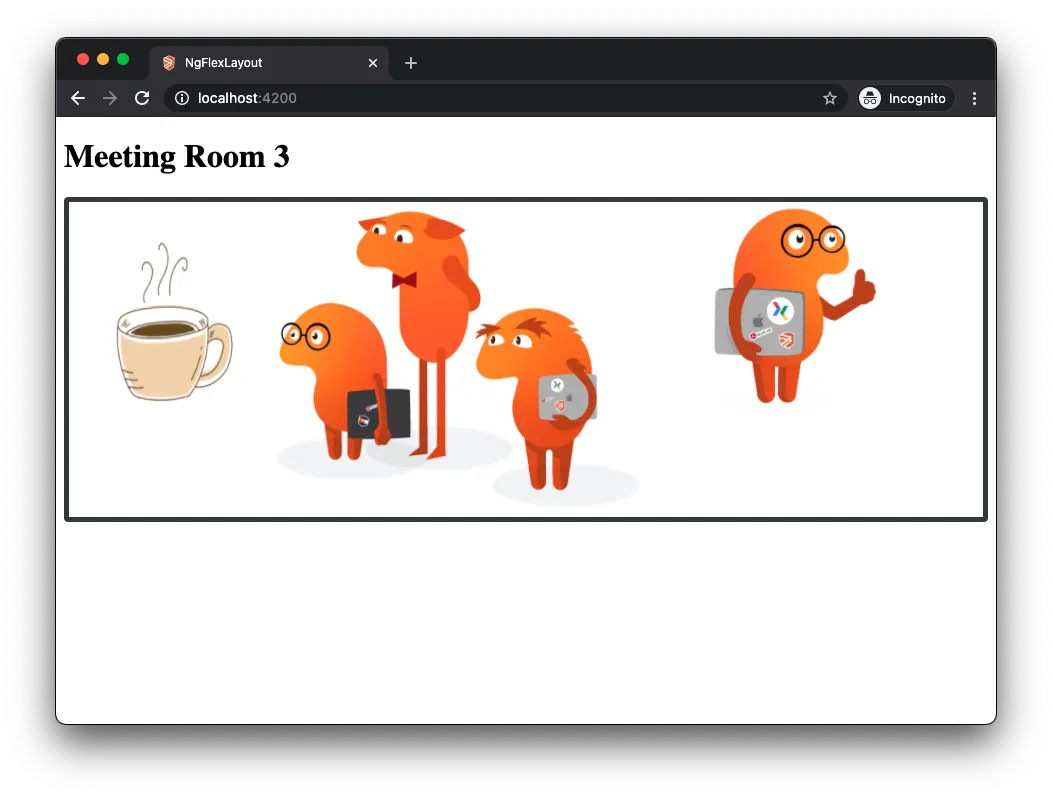
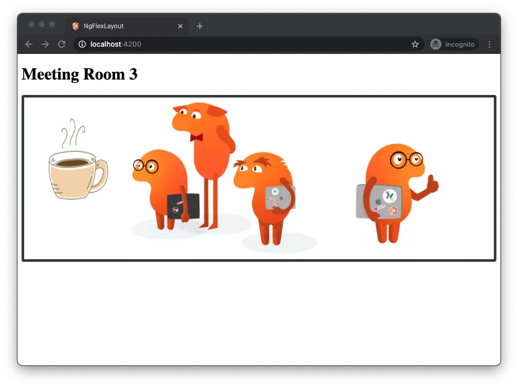
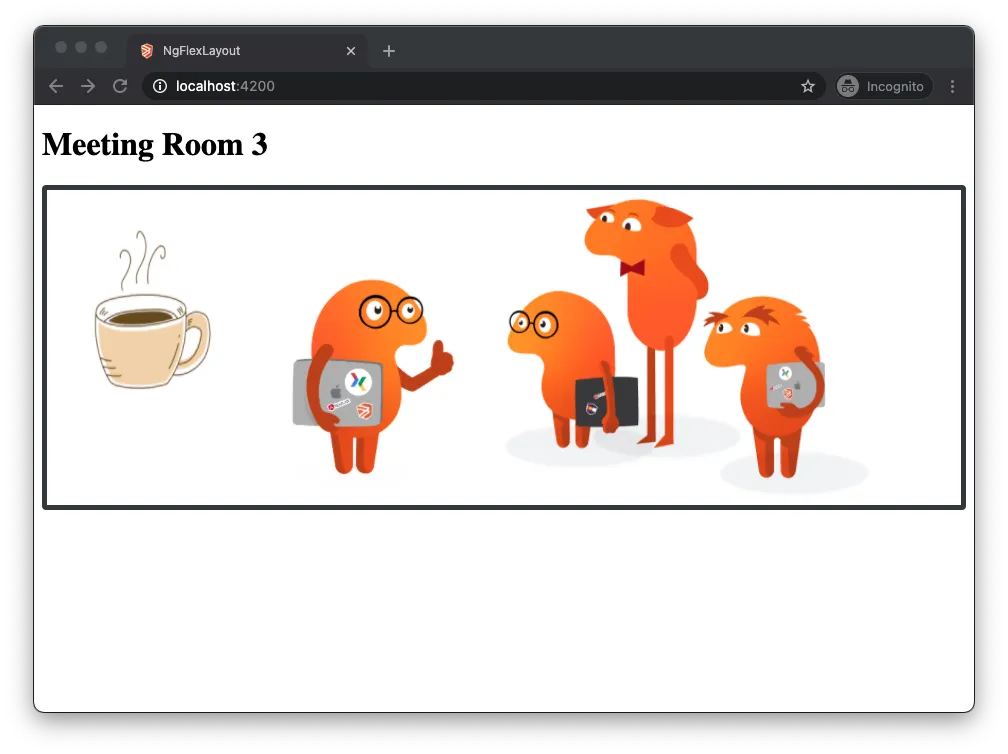
This is Mr. Briebug:
Mr. Briebug has an important meeting to attend.
The Briebug Collective is getting together to determine the best single-origin coffee to order for the office. Now, Mr. Briebug, after an abnormally high caffeine consumption is a little disoriented and needs our assistance getting to the meeting.
Because Mr. Briebug is the local expert on all things coffee he requires his own #coffeeGuru container. Let's do some flexing and get him in the meeting!
Let's initiate the flex layout and get things organized in a row.
Hey! Look at that Mr. Briebug is in the meeting now but he's still got the coffee buzz going and needs further guidance to his spot in the room.
Put him into a column and then using the fxLayoutAlign directive move him to the bottom of the room.
This on the #coffeeGuru container is the same as:
With Mr. Briebug in the back of the room there is just one final step: move him to the front of the room so he can start to educate these others on the origin of coffee.
There! Now he's in his spot.
Hopefully now we'll get some good coffee around here. Finally.
Responsive Breakpoints
Probably the most powerful resource contained within Angular Flex Layout is the responsive API for screen sizes.
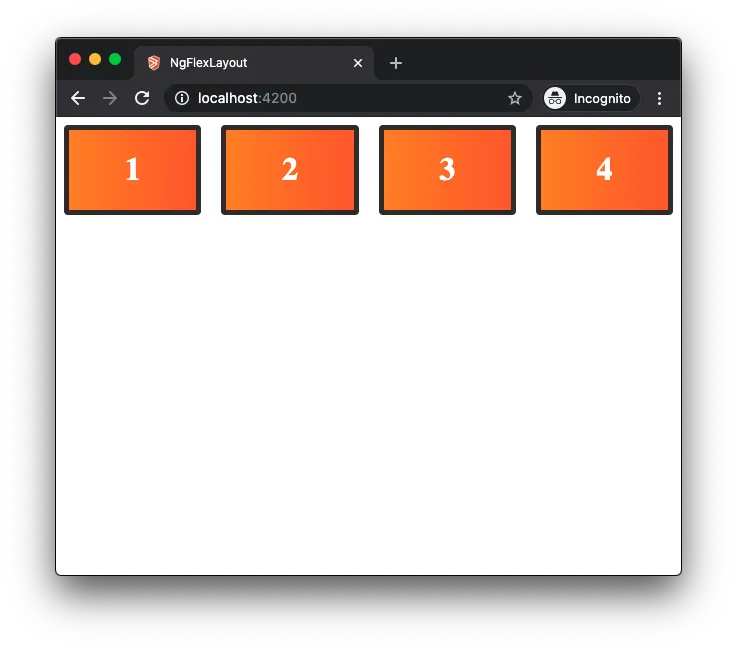
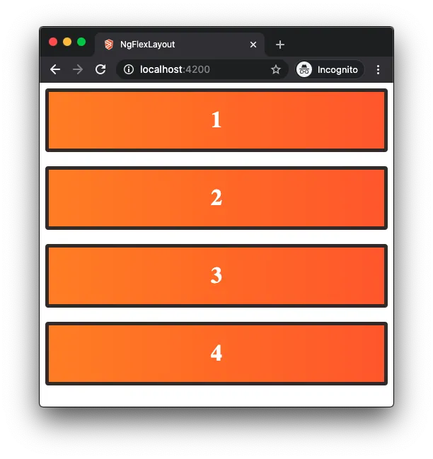
Let's bring the cards back into play again. This time we only have four but we only want them in a row if the screen is big enough.
So we'll add:
Now, when the screen is shrunk down to 599px or less the layout changes to a column:
We can also show or hide content based on a breakpoint:
Now, whatever is in this container when the screen is LESS then 599px, the content will hide.
To take a closer look and do some hacking yourself on this example, checkout the Stackblitz here.
For just about every Flex Layout directive there is the option of breakpoints. For your convenience, checkout the below table for a list of the available aliases. For more information on the Responsive API from Angular Flex Layout and more cool tables like this, checkout their wiki on Github here.
Breakpoint
Media Query
xs
'screen and (max-width: 599px)'
sm
'screen and (min-width: 600px) and (max-width: 959px)'
md
'screen and (min-width: 960px) and (max-width: 1279px)'
lg
'screen and (min-width: 600px) and (max-width: 959px)'
xl
'screen and (min-width: 960px) and (max-width: 1279px)'
It-sm
'screen and (max-width: 599px)'
It-md
'screen and (max-width: 959px)'
It-lg
'screen and (max-width: 1279px)'
It-xl
'screen and (max-width: 1919px)'
gt-xs
'screen and (min-width: 600px)'
gt-sm
'screen and (min-width: 960px)'
gt-md
'screen and (min-width: 1280px)'
gt-lg
'screen and (min-width: 1920px)'
Conclusion
The Angular Flex Layout package, as we have seen, has some nice features. One of the best being the Responsive Breakpoints API: The ease of adding breakpoints for different screen sizes makes for a simplistic approach and less media queries in your CSS files.
With that, I hope you have found this article resourceful and can put what you have learned to good use! If you have more questions on this package there is much, much more information on the Angular Flex Layout wiki here.